About Our Collection
“It was one of those moments that you come across someone and just know you’re speaking the same language.’ This is how Michal Silver, Creative Director of Christopher Farr Cloth, describes her introduction to Newfoundland-born interior designer Scott Yetman, which would mark the beginning of a kinship through something that was, in Michal’s words, ‘even bigger than design.’
Upon meeting, Michal had just come from an exhibit at the Tate Modern centred on Agnes Martin, whose abstract expressionist paintings had resonated with her deeply. Scott had been a long-time admirer of the Canadian artist’s crisp lines, dots and sense of purity, elements which were apparent in his own projects, from the interiors of sleek townhouses to lakeside getaways. The two connected over a spirituality they had both found in Martin’s work and, after a lunch that trickled late into the afternoon, Michal asked Scott to meet again—and for him to come with designs for fabrics and wall coverings that showcased an original point of view based on, simply put, what he thought would make a wonderful collection.
Being at the helm of a house of fabrics, papers, passementeries and rugs, working with textile designers has always been a natural part of Michal’s process. But the creative director felt the need for a third dimension in the work of Christopher Farr—one that she would soon find with Scott, whose knowledge of texture combined with a greater vision and understanding of space offered that new layer. Scott’s way of approaching colour and pattern seemed to be unlike anyone else’s, and his ability to add a deeply personal touch to a modern aesthetic drew Michal in immediately. ‘He had a point of view that we didn’t have before in the collection,’ she notes in a conversation about the differences between working with interior designers versus working with product or textile designers. ‘Scott really sees a room: he doesn’t just design fabric—he visualises it on the drapes, on the couch… it’s his vision that really makes it all come to life.’
The unique element in Scott’s minimalistic way of designing lies largely in his ability to layer in a spare way. Moving away from the tone-on-tone style of the 90s, each element of his designs are chosen meticulously and well thought-out, leading to an aesthetic that is at once pure but that urges the viewer to look at a stripe in a different light. Mastering minimalism in a way that maintains warmth is an ongoing challenge for designers, but the subtle New England influence that manifests itself in Scott’s designs makes them, contemporary as they are, unpretentiously preppy—and irrefutably homey.
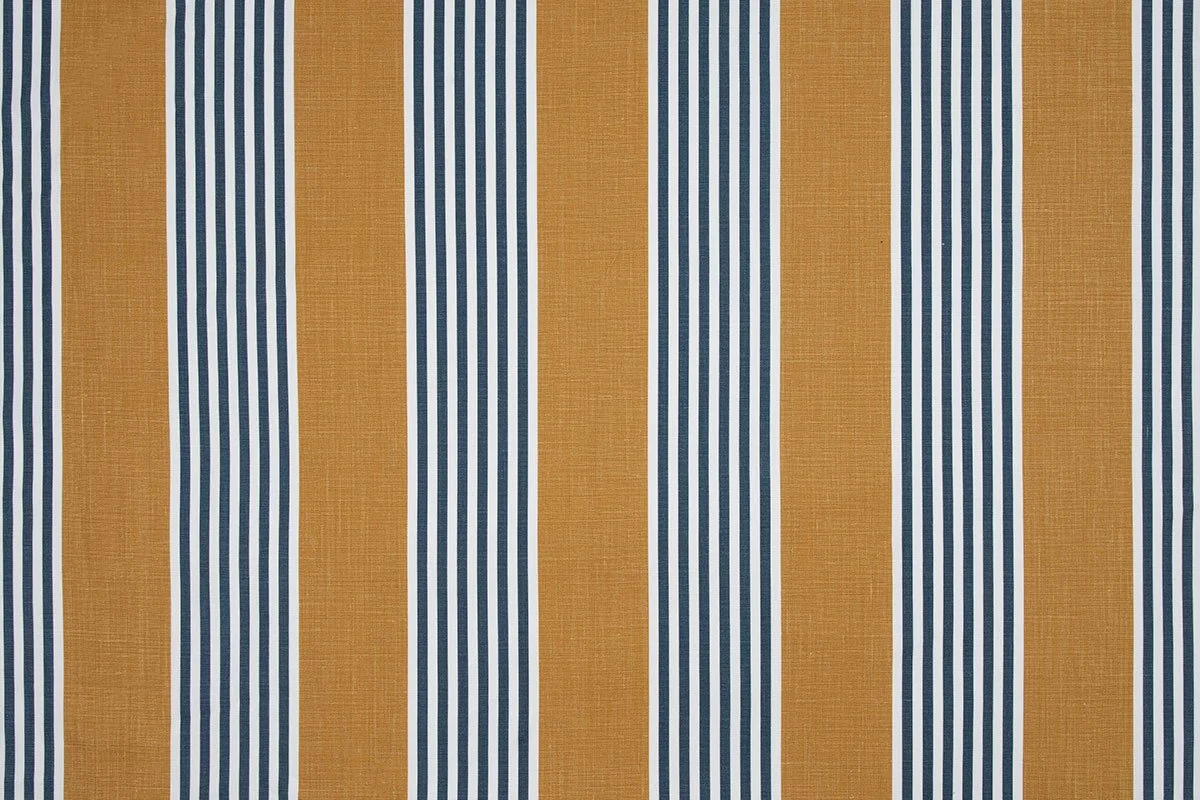
He [Scott] started to play with colours we always work around, but it was interesting to see him take our palette and mix it differently,’ says Michal. ‘We would traditionally never do something as graphic as bridging olive green with black, but with Scott it worked. He introduced a fantastic new teal-y blue—dark but with tints of green—and put it with a honey colour that led to such a crisp feel. His intrigue with our original voice and ability to bring something different that nonetheless fits with the brand is undeniable.’
As for the meaning behind each of Scott’s cloths, each one’s name relates to a Canadian place with a sentimental location. Bay Street, named after Toronto’s financial district, draws its inspiration from men’s tailoring, with a delicate stitching that is at once clean and ever so slightly imperfect; Bolton’s subtly yet intricately textured weave wears its topographical inspirations with certainty—we feel as if we are looking over faraway farms and forests. Algonquin’s simple, back-to-the-roots stitching pays homage to the national park it takes its name from, Hudson gives a proud nod to the centuries-old Hudson’s Bay Stripe, and Brome’s fresh and crisp stripes are effortlessly nautical—as if they were made for the soft linens and cottons on which they are printed.
The collection has been featured in publications such as World of Interiors, Mixte Magazine, British House & Garden and House & Home. It is distributed internationally by Christopher Farr Cloth, hand-block printed on Belgian linen in London, with fabrics woven in Belgium.
The collection has been featured in publications such as World of Interiors, Mixte Magazine, British House & Garden and House & Home. It is distributed internationally by Christopher Farr Cloth, hand-block printed on Belgian linen in London, with fabrics woven in Belgium. The meaning behind each cloth’s name relates to a Canadian place with a sentimental location. Bay Street, named after Toronto’s financial district, draws its inspiration from men’s tailoring, with a delicate stitching that is at once clean and ever so slightly imperfect; Bolton’s subtly yet intricately textured weave wears its topographical inspirations with certainty—we feel as if we are looking over faraway farms and forests. Algonquin’s simple, back-to-the-roots stitching pays homage to the national park it takes its name from, Hudson gives a proud nod to the centuries-old Hudson’s Bay Stripe, and Brome’s fresh and crisp stripes are effortlessly nautical—as if they were made for the soft linens and cottons on which they are printed.
Bay Street
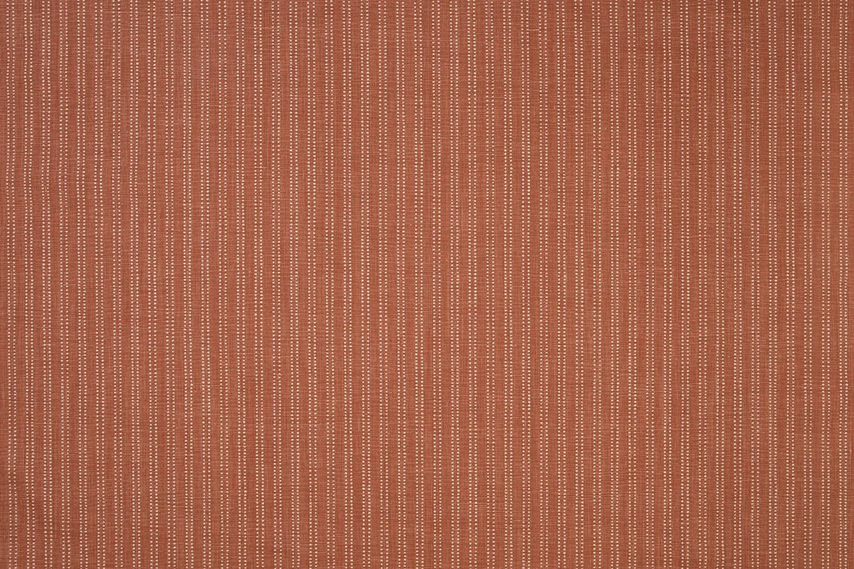
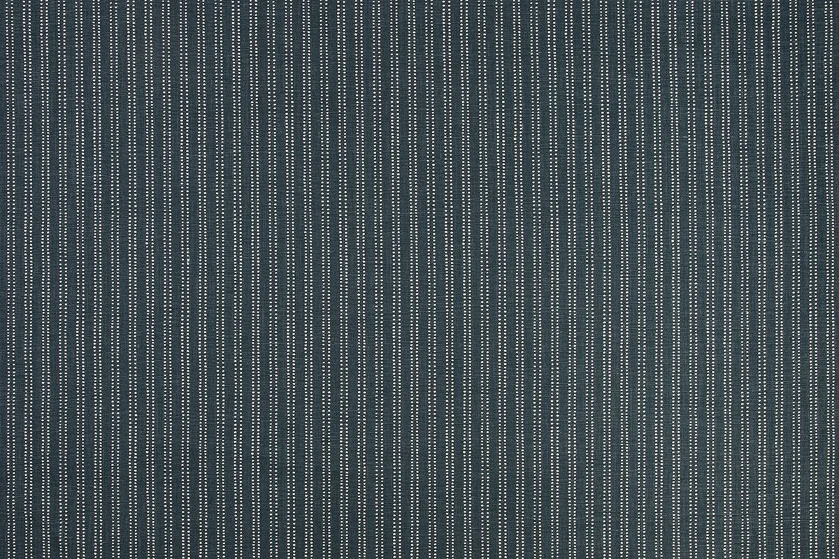
The classic pinstripe used in men’s tailoring inspired this playful woven fabric. Scott was influenced by renowned designer Georgio Armarni and the luxurious Italian fabrics he uses in his tailoring. The design is named after Bay Street in Toronto, famed as the Wall Street of Canada.
Fabric
Bolton
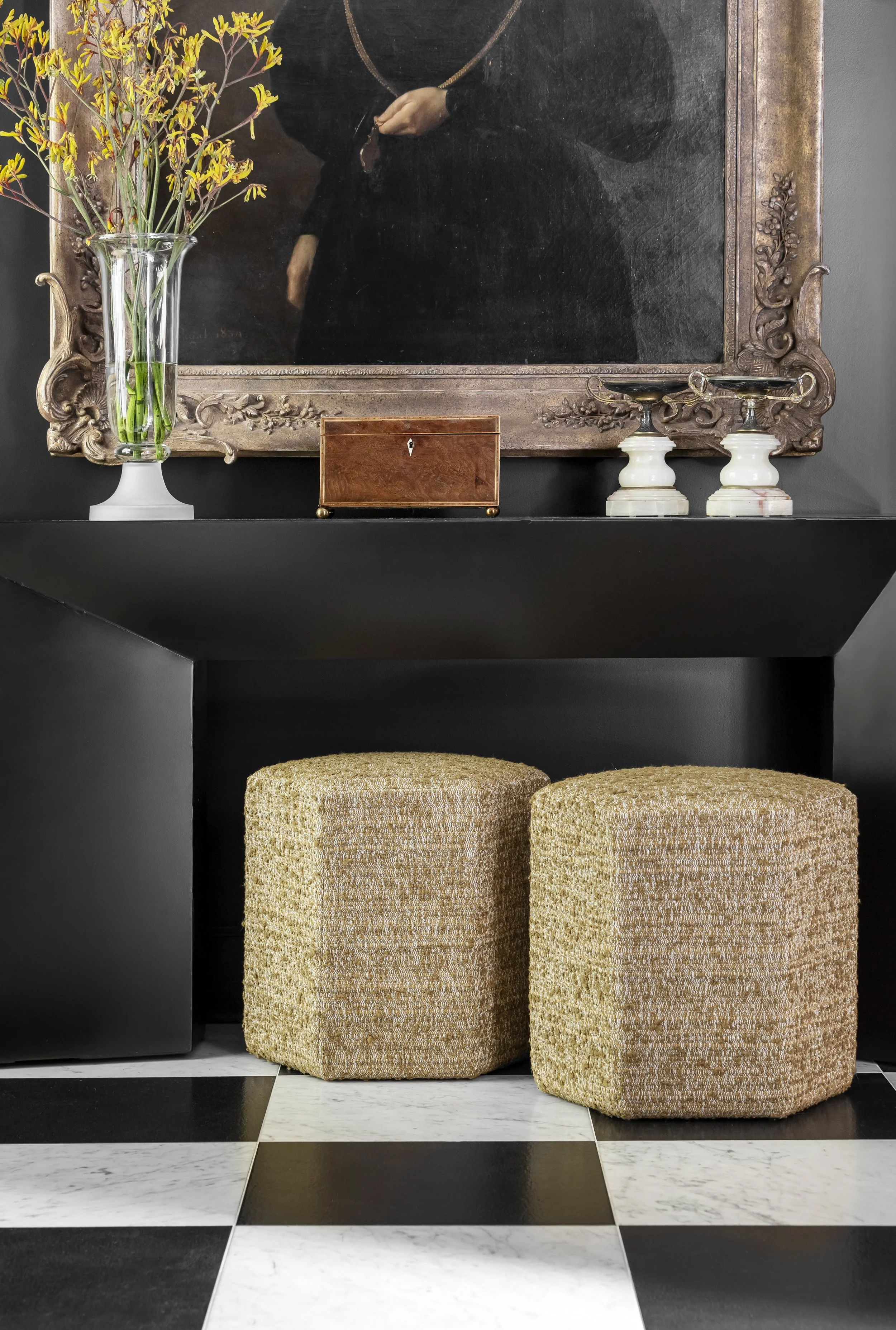
Bolton continues Scott’s interest in fabrics used in men’s tailoring. Working closely with our design team, Scott wanted to introduce a luxurious bouclé fabric with an uneven texture by playing with the warp and waft structure of the weave. In addition, two dimensions of colour and tone have been created by using a mixture of tight and loose yarns.
Fabric
Algonquin
Algonquin is named after the Indigenous people now living in Eastern Canada, a place that is very special to him. Scott wanted to create a simple ticking stripe within his collection that would work as a solid to compliment his other designs. The design’s scale, texture and simplicity are inspired by the works of Agnes Martin, and the completed fabric has a primitive elegance.
Fabric
Wallpaper
Brome Stripe
Brome Stripe was first designed as a wallpaper, but the design was so strong it was also paired with a printed fabric. The patternation of the line creates the illusion of a solid line, but when closely examined, the fine detailing of the individual lines can be seen. Scott wanted to include a large scale stripe within his collection offering.
Fabric
Wallpaper
The Hudson Stripe
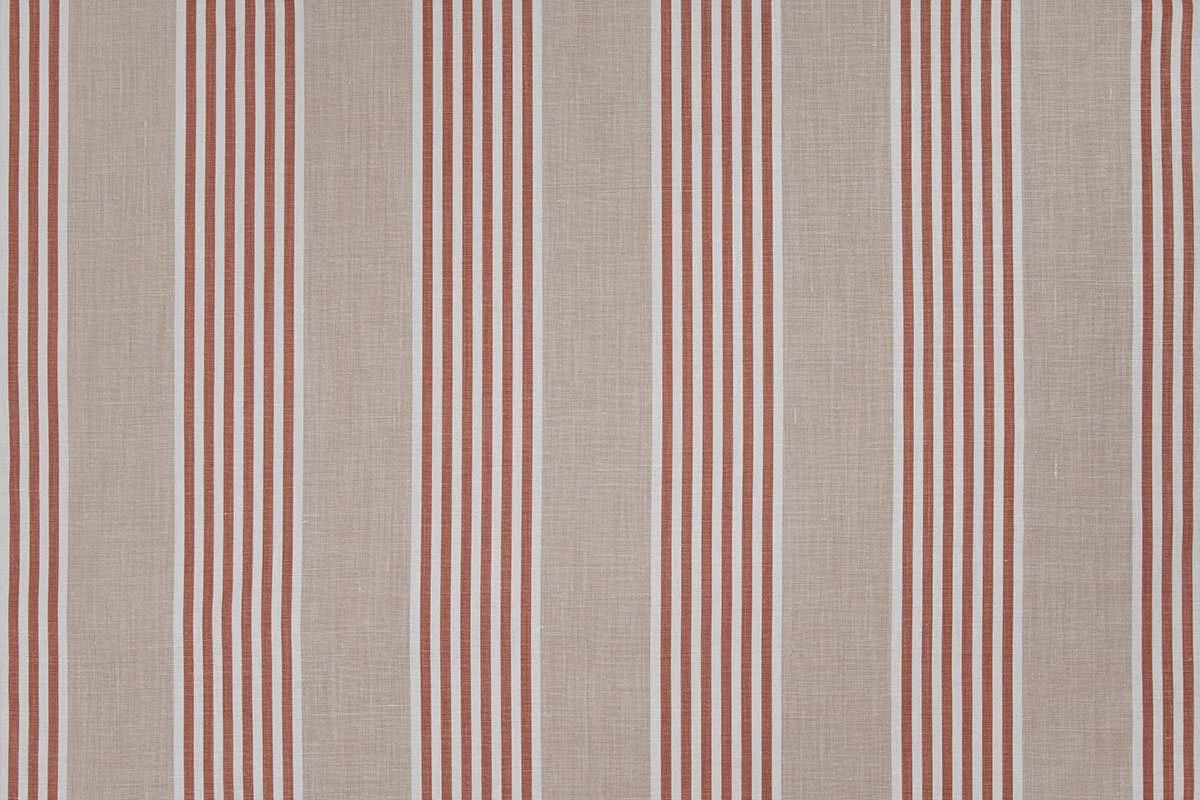
The design for the Hudson Stripe was inspired by a traditional Hudson’s Bay point blanket. This blanket style was traded by the Hudson’s Bay Company in Canada and the United States from 1779 to the present. Scott has played with the scale of the stripe, the negative space between them, infilling them will thinner contrasting lines.
Fabric
Green
Taupe
Honey
Olive
Pale Blue
